
WHAT SHOULD I CONSIDER WHEN CHOOSING MY PICTURE FRAME?
The room’s décor should always be considered, but not so much that you sacrifice what complements the artwork. Remember, the frame should always enhance the artwork.
The place your picture will hang is very relevant to the colours used, the treatment recommended (glass type etc) and the overall style of the framing. The team at Gallery 360 strives to achieve the appropriate look for the piece, while complementing your decor. To improve our understanding of your requirements so we can advise you more appropriately, we can visit your home or office to view the final setting.
Consider using a mat board as a border that surrounds your art within the frame. It is more than just a pretty colour; the purpose of matting is both cosmetic and protective.
Mat boards are used to draw the eye and bring out the colours in an image. There are many creative and elegant techniques that can be used, to add distinction to your framed piece. The addition of mat boards can mean the difference between an insignificant piece that gets lost on a wall and a dramatic one that serves as a perfect accent for a room.
Mat boards can also serve to highlight a colour, accent a shape or increase the overall size of the framed piece. Colour plays an important role in this transformation process. For example, using a light mat has the effect of lightening and enlarging the artwork, while using a dark mat serves to darken and shrink the image.
A Gallery 360 picture frame will enhance and add value to your artwork. Framing images is just the beginning. An ornament or piece of memorabilia in the appropriate box frame can look better than ever expected. We’ve framed virtually everything – medals, scrolls, insects, shells, fossils, swords, guns, souvenirs, collectables, masks, models, shoes, sporting memorabilia and more. Bring your items in and our experts will advise you of your options.
CHOOSING PICTURE FRAMES TO MATCH YOUR DECORATING STYLE
Have you ever seen a picture frame that either looked wrong for the picture or wrong for the surrounding decor? Although there are no ironclad rules for selecting frames, here are some general tips follow:
- Remember that frames loosely fall into three categories:
- traditional (often wood frames with some embellishment such as ornate carving, Oriental accents or canvas/ linen inserts),
- modern (metal or ultra plain wood, perhaps only 8-10mm of the frame showing as you face the picture) and
- transitional (minimal ornamentation with a moderate amount of frame showing on its face).
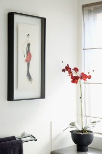
- Choose versatility with a plain transitional wood picture frame, either stained or painted, perhaps with a simple stripe of contrasting paint colour or metallic. These frames work in nearly every decor and suit most styles of art; they also can usually move from room to room easily.
- Use old-style, ornate gold frames in traditional, often formal environments with decorating styles such as 17th- and 18th-century styles, as well as with Victorian and English country decor; they can also be used in eclectic-style rooms. These frames generally work best with art executed in representational (non abstract) styles.
- Give yourself more latitude if your decorating style is eclectic. Frames and artwork can mix it up a bit, but you’ll achieve a more harmonious atmosphere if there are other furnishings in the room (perhaps a coffee table or chair) that also reflect the style of the frame and picture.
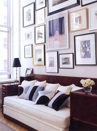
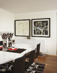
- Use the same or similar frames (and mats) to unite a grouping. Black-and-white pen-and-ink drawings of varied subjects blend nicely when all are edged with, say, black metal or walnut-stained picture frames; colour family portraits may gain the same sense of unity with, for example, whitewashed wood frames, pewter frames or brass frames.
- Ask for help from our team at Gallery 360. We love frames and are happy to offer helpful advice for selecting a great frame and mat for a picture.
TIPS
- Be careful not to let a frame overwhelm a picture; this most often happens when a wide frame is placed around a small or delicately executed work of art. Also, frames can jar the decor if they’re too large for the wall space or if they’re too fancy to be hung over a casual easy chair.
- When hanging artwork above a piece of furniture, place it in close enough proximity – usually just a few inches above the furniture – so that the eye takes in the objects as a single unit.
- Don’t let a dominant-coloured mat make the artwork play second fiddle. Neutral mats are usually best.
For further information on how we can help you, and pricing, please click here.